CTEC2712 Web application development

Lab exercises are designed to help you gain practical experience with web technologies. You should elaborate on these exercises to confirm you understand and deploy the learning you find here in your own code.

A responsive page

In this exercise we will create a simple responsive page. We will be using media queries to change our layout at different viewport widths.

We will develop in a mobile first way, so we will need to emulate a mobile device using the chrome developer tools.

Set up

Create a standard index.html file and link it to a style.css file.

Add the following content.

 1
 2
 3
 4
 5
 6
 7
 8
 9
10
11
12
13
14
15
16
17
18
19
20
21
22
23
24
25
26
27
28
29
30
31
32
33
34
35
36
37
38
<!DOCTYPE html>
<html lang="en">
<head>
    <meta charset="UTF-8">
    <meta name="viewport" content="width=device-width, initial-scale=1.0">
    <title>A responsive menu</title>
    <link rel="stylesheet" href="style.css">
</head>
<body>
    <header>
        <h1>My awesome website</h1>
        <nav id="menu">
            <a href="#">Home</a>
            <a href="#">Blog</a>
            <a href="#">Gallery</a>
            <a href="#">Contact</a>
            <a href="#">About</a>
        </nav>
    </header>
    <main>
        <section>
            <h2>Lorem, ipsum.</h2>
            <p>Lorem ipsum dolor sit amet consectetur adipisicing elit. Doloribus impedit perferendis quas numquam. Nulla consequuntur nihil laudantium, facilis fugit vero numquam iusto dolore repellat illo?</p>
            <p>Accusamus sequi consequatur nostrum tempore quibusdam atque voluptas quod, modi corrupti mollitia cupiditate quasi quas illo eum laborum sunt delectus inventore ab numquam et necessitatibus.</p>
        </section>
        <section>
            <h2>Quisquam, suscipit.</h2>
            <p>Lorem ipsum dolor sit amet consectetur adipisicing elit. Rerum deserunt dolorum amet, dignissimos dolore eum, et facilis libero unde repellendus ea mollitia? Sed, labore dolor.</p>
            <p>In laborum nemo corporis deserunt non quisquam magnam nisi. Dolorum molestiae, quaerat possimus quae mollitia inventore libero nobis quasi ipsam saepe nulla labore! Dignissimos, nesciunt.</p>
        </section>
        <section>
            <h2>Quasi, illo.</h2>
            <p>Lorem ipsum dolor sit amet consectetur, adipisicing elit. Nam corrupti, est error sed necessitatibus iste a minima, ea deserunt iusto, deleniti accusamus odio ipsum eos?</p>
            <p>Minima ipsa, eaque cupiditate molestias possimus tempore assumenda quos. Quis eius autem, maiores doloremque iure voluptate minima, dolorum perferendis exercitationem sed, asperiores quo consectetur voluptatum.</p>
        </section>
    </main>
</body>
</html>

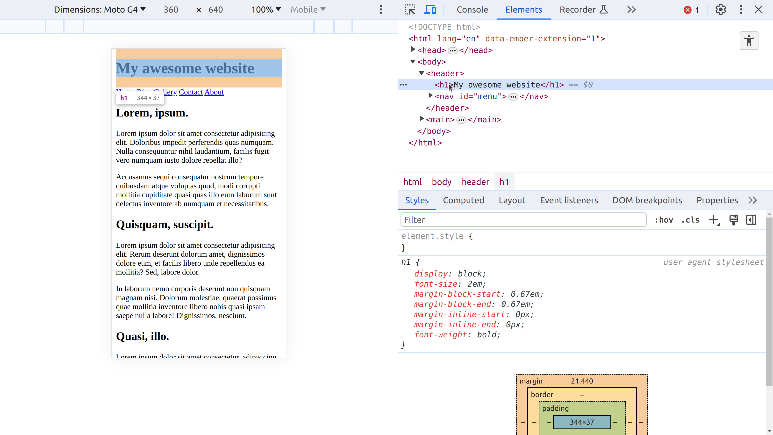
We have a <header> containing a heading and a menu. The <main> element has three <section> elements each with a heading and some paragraphs.

Without any style information, the site looks pretty plane.

Device mode

Before we start developing any styles, we need to consider how our site will appear on a mobile device. The browser developer tools panel allows us to control the size of your viewport by changing the width of the devtools panel.

Shrink your viewport to about 360px wide. The site should look a bit like this.

If we want to emulate a mobile device more accurately, we can use device mode in Google Chrome. You can activate the device mode by clicking on the device mode icon or using Ctrl + Shift + M (with the devtools open).

This video introduces some of the options in device mode in Chrome

Activate device mode and select a mobile device from the dropdown menu and you should see something very close to what a mobile device user would see.

Emulating a mobile device

Emulating a mobile device

It’s important to understand that by default the site can pretty much be viewed comfortably on any sized device.

It can also be navigated fairly comfortably using a screen reader, though a few aria-labelledby attributes and a list inside the menu might improve the experience.

Adding some mobile-first styles

Now we are looking at the site from a mobile user perspective, we can start to give the site some default styles.

 1
 2
 3
 4
 5
 6
 7
 8
 9
10
11
12
13
14
15
16
17
18
19
20
21
22
23
24
25
26
27
28
29
30
31
32
body {
    display: grid;
    margin: 0;
    font-family: system-ui;
}

header {
    background-color: hsl(100, 50%, 30%);
    color: hsl(100, 50%, 90%);
    font-size: 0.9em;
}

header, 
main {
  padding-inline: 0.5rem;
}

h1 {
    margin-block: 0.5rem;
}

nav {
    display: flex;
    padding-block: 0.5rem;
    justify-content: space-between;
    gap: 0.5rem;
}

nav a {
    text-decoration: none;
    color: inherit;
}

Study the above styles and make sure you understand what each rule does. Essentially we are overiding a few defaults, setting some colours and adding a bit of padding. We also set the <body> to a grid layout (mainly just to contain the <h1> margins within the header) and set the <nav> to a simple flexbox layout.

The new styles make a big difference, even though most of the elements are basically in the same place as they were before.

These are the default styles which will apply under all circumstances.

Thinking about wider viewports

Now, with some basic styles in place, we can look at how the site handles a larger viewport. Expanding to 500px reveals how the justify-content setting spreads the links out evenly.

This seems fine. However, if we expand even more then the menu starts getting perhaps too spread out and we start to see opportunities to move the menu up to the space next to the main heading.

To handle this we need to change the layout of the header element to flexbox so the menu pops up to the right.

 1
 2
 3
 4
 5
 6
 7
 8
 9
10
11
12
13
14
15
16
17
18
19
20
21
22
23
24
25
26
27
28
29
30
31
32
33
34
body {
    display: grid;
    margin: 0;
    font-family: system-ui;
}

header {
    background-color: hsl(100, 50%, 30%);
    color: hsl(100, 50%, 90%);
    font-size: 0.9em;
    display: flex;
    justify-content: space-between;
}

header,
main {
    padding-inline: 0.5rem;
}

h1 {
    margin-block: 0.5rem;
}

nav {
    display: flex;
    padding-block: 0.5rem;
    justify-content: space-between;
    gap: 0.5rem;
}

nav a {
    text-decoration: none;
    color: inherit;
}

These simple changes change the layout of the header completely, fitting the space more effectively.

However, with these changes, now our mobile site no longer fits on the page. The heading wraps, which we don’t like. Worse still, the menu is too wide and so it overflows the viewport and causes a horizontal scrollbar which is very awkward for mobile users.

We have seen that there are so-called intrinsic ways to deal with this. For example, by adding flex-wrap, we could allow the menu items to wrap across multiple rows. However, sometimes the best solution is to introduce a simple media query.

Media queries

Media queries are a core tool of responsive web design, enabling us to make changes to the CSS rules based on conditions detected from the users browser.

We need to find the minimum width at which we are happy with the default design. I have chosen 600px as the breakpoint.

Moving the above changes into a media query allows us to specify that they should only be applied when the viewport is wider that 600px.

 1
 2
 3
 4
 5
 6
 7
 8
 9
10
11
12
13
14
15
16
17
18
19
20
21
22
23
24
25
26
27
28
29
30
31
32
33
34
35
36
37
38
39
body {
    display: grid;
    margin: 0;
    font-family: system-ui;
}

header {
    background-color: hsl(100, 50%, 30%);
    color: hsl(100, 50%, 90%);
    font-size: 0.9em;
}

@media (width>=600px) {
    header {
        display: flex;
        justify-content: space-between;
    }
}

header,
main {
    padding-inline: 0.5rem;
}

h1 {
    margin-block: 0.5rem;
}

nav {
    display: flex;
    gap: 0.5rem;
    padding-block: 0.5rem;
    justify-content: space-between;
}

nav a {
    text-decoration: none;
    color: inherit;
}

Now the site will show the default styles at any size below 600px and will conditionally include the two additional style rules only if the viewport is 600px or greater.

Styling the main content

OK, let’s think in a similar way about the main content. It’s pretty simple so we won’t need a huge amount of styles.

First, considering the smaller page widths, under about 650px, we don’t really need to make any changes. The default behaviour is pretty good.

As we grow the width of the viewport, the site still looks OK until we start seeing very long lines of text.

An optimal line length for reading text is somewhere around 60-70 characters. So, we can actually add some default styles to limit the paragraph width to 70ch and add a bit more line-height at the same time to space the lines out a bit more.

 1
 2
 3
 4
 5
 6
 7
 8
 9
10
11
12
13
14
15
16
17
18
19
20
21
22
23
24
25
26
27
28
29
30
31
32
33
34
35
36
37
38
39
40
41
42
43
44
45
46
47
48
49
body {
    display: grid;
    margin: 0;
    font-family: system-ui;
}

header {
    background-color: hsl(100, 50%, 30%);
    color: hsl(100, 50%, 90%);
    font-size: 0.9em;
}

@media (width>=600px) {
    header {
        display: flex;
        justify-content: space-between;
    }
}

header,
main {
    padding-inline: 0.5rem;
}

h1 {
    margin-block: 0.5rem;
}

nav {
    display: flex;
    gap: 0.5rem;
    padding-block: 0.5rem;
    justify-content: space-between;
}

nav a {
    text-decoration: none;
    color: inherit;
}

main {
    display: grid; 
    place-items: center;
}

p {
    max-width: 70ch;
    line-height: 1.5em;
}

We also place the content in the center by giving the <main> element a grid layout. So the result is that the main content is given more space and the paragraphs are no longer stretching out.

At this point, we should be careful to check that the site still works well on smaller devices. In fact, it seems like an upgrade.

Now, we might want to consider whether the content can be given a more interesting layout when there is space in the viewport to do so. So far it looks like this:

We can add a media query to keep this configuration below 900px and add some new rules only for larger viewports. In side the media query, we can specify a complex grid template for the <main> element.

 1
 2
 3
 4
 5
 6
 7
 8
 9
10
11
12
13
14
15
16
17
18
19
20
21
22
23
24
25
26
27
28
29
30
31
32
33
34
35
36
37
38
39
40
41
42
43
44
45
46
47
48
49
50
51
52
53
54
55
56
57
58
59
60
61
62
63
64
65
66
67
68
69
70
71
72
73
74
75
76
77
78
79
80
81
body {
    display: grid;
    margin: 0;
    font-family: system-ui;
}

header {
    background-color: hsl(100, 50%, 30%);
    color: hsl(100, 50%, 90%);
    font-size: 0.9em;
}

@media (width>=600px) {
    header {
        display: flex;
        justify-content: space-between;
    }
}

header,
main {
    padding-inline: 0.5rem;
}

h1 {
    margin-block: 0.5rem;
}

nav {
    display: flex;
    gap: 0.5rem;
    padding-block: 0.5rem;
    justify-content: space-between;
}

nav a {
    text-decoration: none;
    color: inherit;
}

main {
    display: grid;
    place-items: center;
}

p {
    max-width: 60ch;
    line-height: 1.5em;
    margin-block: 0.5em;
}

@media(width>=900px) {
    main {
        grid-template-columns: auto auto 40px auto auto;
        grid-template-rows: 50px auto 25px 25px auto;
        margin: 2rem auto;
    }

    section {
        border: 1px solid hsl(100, 50%, 20%);
        padding: 25px 50px;
    }

    section:nth-child(1) {
        grid-column: 1/4;
        grid-row: 1/3;
        background-color: hsl(100, 50%, 70%);
    }

    section:nth-child(2) {
        grid-column: 3/6;
        grid-row: 2/5;
        background-color: hsl(100, 80%, 80%);
    }

    section:nth-child(3) {
        grid-column: 2/5;
        grid-row: 4/6;
        background-color: hsl(100, 80%, 70%);
    }
}

This has a radical impact on the layout of the main content on larger devices whilst leaving the layout unaffected on smaller devices.

Conclusions

In this exercise we have introduced a simple mobile-first design process. We first established some default styles, then looked we used media queries to introduce break points in our design which took advantage of the increasing space available.

We used max-width and grid layouts to enable the default styles to be useful as far as possible.

We modified the layout of the <header> element and the <main> element independently at breakpoints which were suitable in each case.

Challenges

Build a responsive design for the following document.

 1
 2
 3
 4
 5
 6
 7
 8
 9
10
11
12
13
14
15
16
17
18
19
20
21
22
23
24
25
26
27
28
29
30
<!DOCTYPE html>
<html lang="en">
<head>
    <meta charset="UTF-8">
    <meta name="viewport" content="width=device-width, initial-scale=1.0">
    <title>Responsive design</title>
</head>
<body>
    <header>
        <h1>Responsive design</h1>
    </header>
    <main>
        <section class="html">
            <h2>HTML</h2>
            <img src="images/html.svg" alt="HTML logo">
            <p>Lorem ipsum dolor sit amet, consectetur adipisicing elit. Dolorum tenetur non quia ratione aliquid ad rem aperiam similique. Quibusdam rem dolor dignissimos praesentium sapiente inventore!</p>
        </section>
        <section class="css">
            <h2>CSS</h2>
            <img src="images/css.svg" alt="CSS logo">
            <p>Lorem ipsum dolor sit amet consectetur, adipisicing elit. Accusantium, labore qui veniam in aspernatur, itaque officia ex doloremque quas nulla, magni architecto laborum vitae rem?</p>
        </section>
        <section class="js">
            <h2>JS</h2>
            <img src="images/js.svg" alt="JS logo">
            <p>Lorem ipsum dolor sit amet consectetur adipisicing elit. Minus cum error, ex atque facilis pariatur nulla et maiores natus nostrum esse incidunt porro vero ducimus?</p>
        </section>
    </main>
</body>
</html>

Try to replicate the following design at below 500px

Try to replicate the following design at below 700px

Try to replicate the following design at below 900px

Try to replicate the following design at above 900px

Don’t look at my solution until you get really stuck.