Lab exercises are designed to help you gain practical experience with web technologies.
You should elaborate on these exercises to confirm you understand and deploy the learning you find here
in your own code.
In this exercise we will look at the default styles applied by the browser and how the main element types behave.
When elements are included in a document they automatically inherit some default behaviour.
Some elements are given additional styles by the browser.
These styles can then be overridden and expanded by adding CSS rules.
Let’s take a few moments to see how various elements behave by default, without any additional style information.
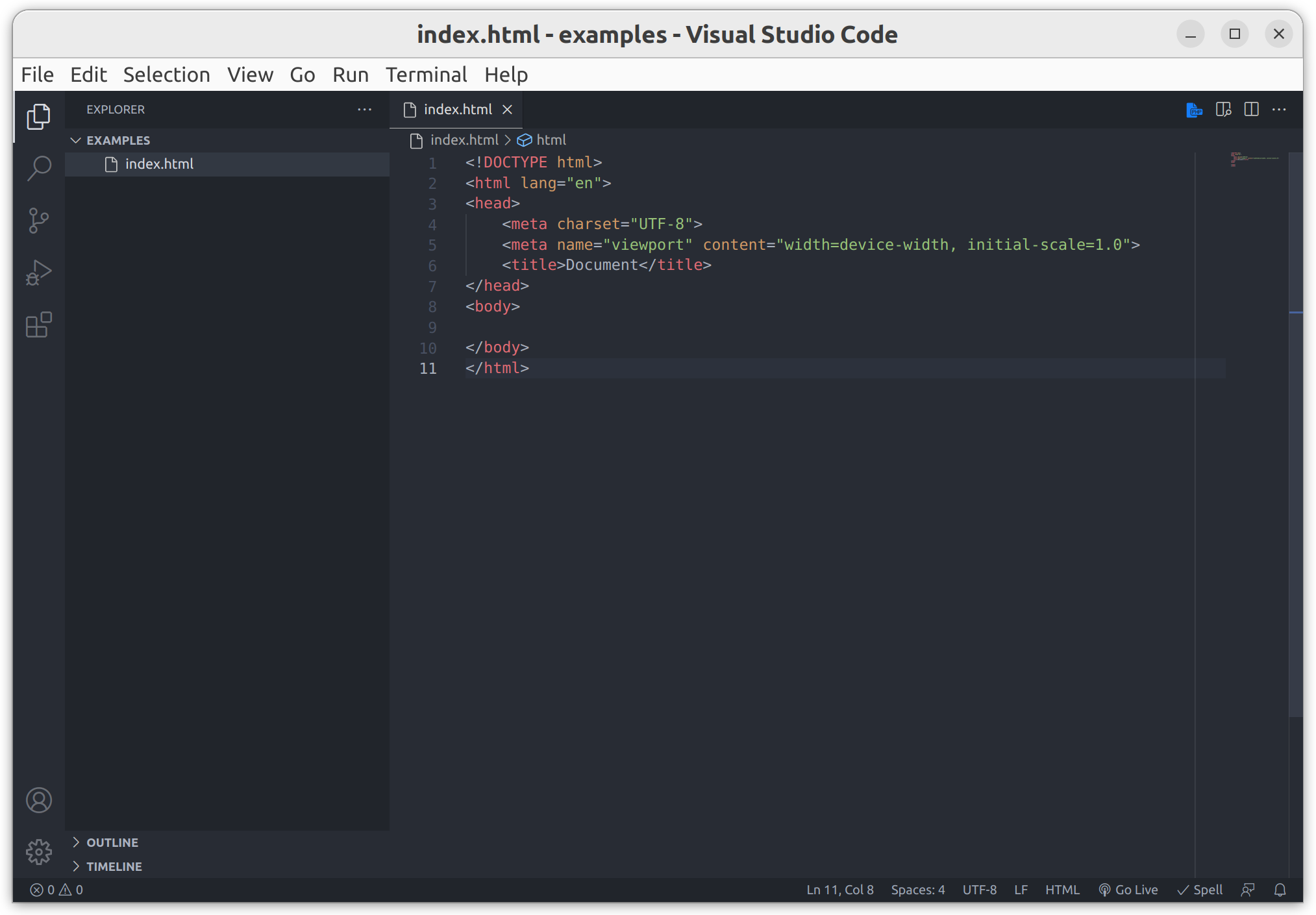
Starting with the basic VSCode template, you should have something like this.
starting point
Simple text
The most basic content is just text, without any tags.
Try adding just some text, directly inside the <body> element.
This was added using the emmet command lorem5*5 to produce five lines of lorem ipsum text, each line being five words long.
 1
 2
 3
 4
 5
 6
 7
 8
 9
10
11
12
13
14
15
<!DOCTYPE html><htmllang="en"><head><metacharset="UTF-8"><metaname="viewport"content="width=device-width, initial-scale=1.0"><title>Adding content</title></head><body> Lorem ipsum dolor sit amet.
Enim nulla molestias pariatur corrupti.
Dicta vero quasi atque veritatis.
Quaerat sunt similique laudantium architecto.
Ut sunt voluptates molestiae eos?
</body></html>
Line breaks and multiple spaces are ignored.
You can add the text all in one line if you want.
I prefer to put one sentence on each line when I have lots of text.
Though I sometimes break longer sentences across multiple lines.
I also changed the content of the <title> element, which is good practice.
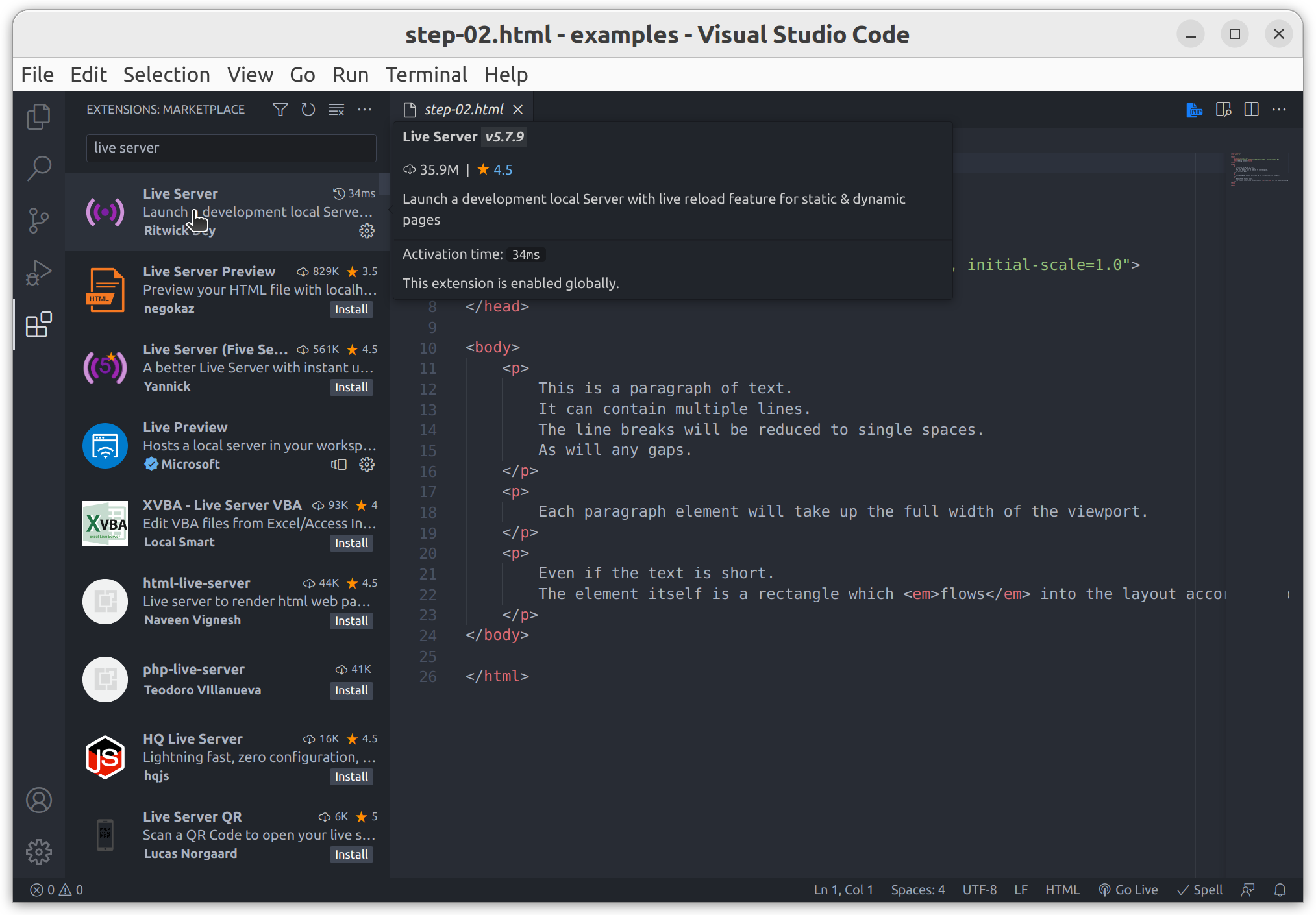
On the left side of your VSCode window, select the extensions icon (usually the bottom icon) or press Ctrl + Shift + X.
Search for “live server” and click the “install” button.
the live server extension
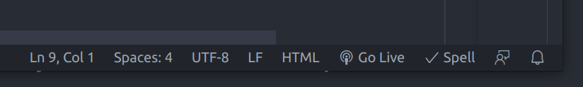
It will take a few moments to install.
Once installed you should see a small “Go Live” button has appeared at the bottom of your VSCode window.
the ‘Go Live’ button
Clicking this will start a simple HTTP server that will serve your project and open a browser tab pointing to the selected file.
The server root will be the top-level folder open in VSCode and is usually available at http://localhost:5000, though this can be configured.
The result is a single, flexible chunk of text.
Notice a few things.
There is a small gap between the text and the edge of the viewport.
There is a default font-family, font-size, color, etc.
Each of the newline characters has been reduced to a single space.
The text wraps to multiple lines if there isn’t enough room.
Default styles
Open the developer tools in your browser.
F12 usually works for me, there are many other ways as we saw in a previous exercise.
It’s often useful to expand the width of the developer tools panel as a simple means to reduce the width of the viewport within which your document is rendered.
It also allows us to give more space to the style information in the elements panel.
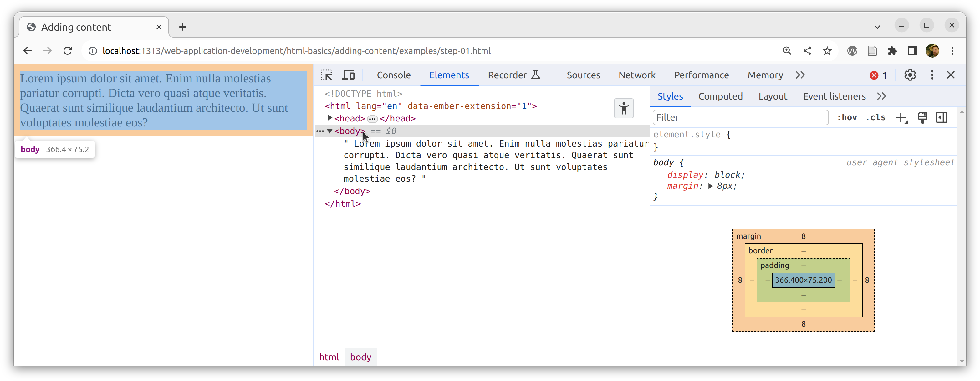
default styles
Selecting an element in the elements panel will highlight the element location in the viewport.
Alternatively pressing Ctrl + Shift + C will enter inspect element mode.
Subsequently, clicking on any element in the page will highlight it in the elements panel.
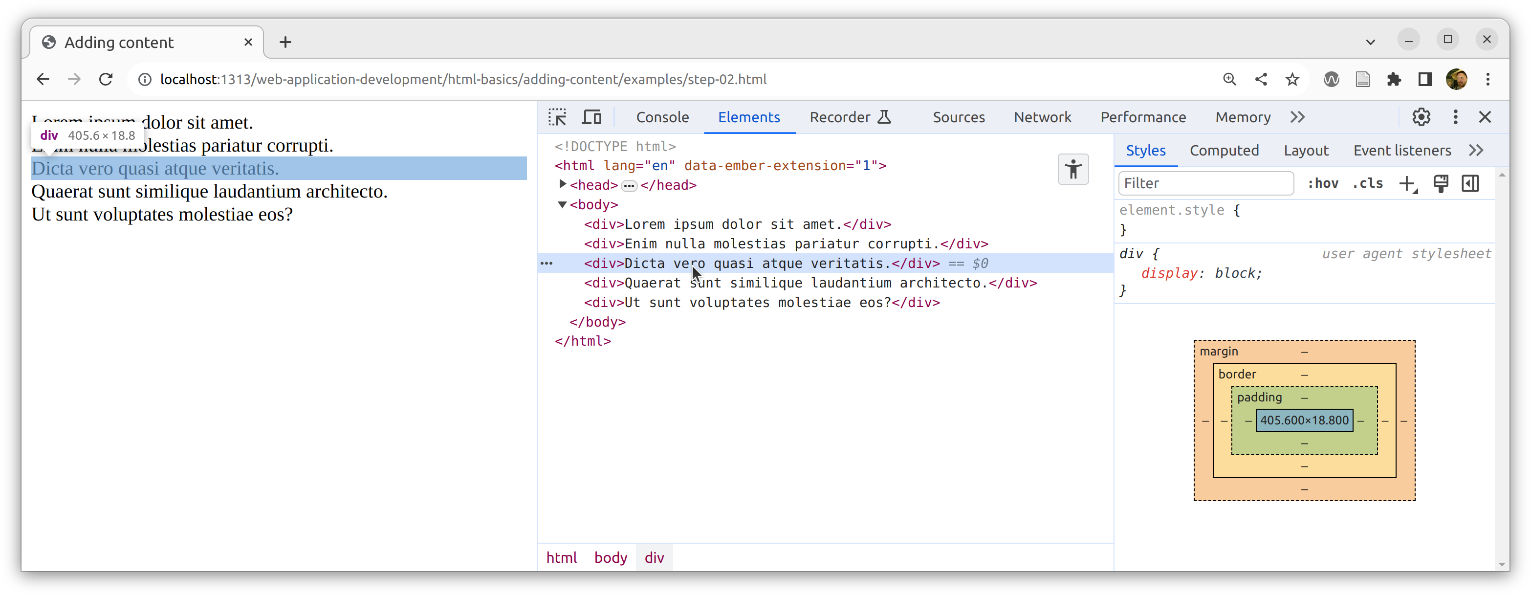
In this case we have selected the <body> element which wraps the entire page.
Notice the text is highlighted with a blue rectangle.
This is the content of the element.
The orange border around the text indicates that the <body> element has a margin.
The diagram in the styles panel also shows the size of the content (width x height) and the size, on each of the four sides (top, bottom, left and right) of the various box properties (padding, border and margin).
In this case, we can see that each side of the <body> element has 8px of margin only.
Above the diagram, we can see that there are styles applied to the <body> element.
This is part of the user agent stylesheet applied by the browser, by default.
This is where the 8px margin comes from.
It also sets the display property to block.
1
2
3
4
body{display:block;margin:8px;}
Different elements will have different default styles.
The Chrome default stylesheet includes hundreds of CSS rules.
block elements
All elements have a display property which determines how the element will behave.
The display property is set to inline by default (which we will see later), but the browser sets this value to block for many common elements.
The <body> element is a so-called block element.
Importantly, this means it will take up the full width of its container.
In this case, the browser viewport is the container (or the <html> element, strictly speaking).
The default margin on the <body> element creates the 8px gap between the text and the edge of the viewport.
The difference between block and inline elements is critical to understand.
A basic example of a block element is a <div>, these elements don’t have any semantic meaning and they are often used to control layout, as we shall see in later exercises.
Since block elements take up the full width of their container, what would happen if we wrapped each chunk of text in a <div> element?
Let’s try it.
 1
 2
 3
 4
 5
 6
 7
 8
 9
10
11
12
13
14
15
<!DOCTYPE html><htmllang="en"><head><metacharset="UTF-8"><metaname="viewport"content="width=device-width, initial-scale=1.0"><title>Adding content</title></head><body><div>Lorem ipsum dolor sit amet.</div><div>Enim nulla molestias pariatur corrupti.</div><div>Dicta vero quasi atque veritatis.</div><div>Quaerat sunt similique laudantium architecto.</div><div>Ut sunt voluptates molestiae eos?</div></body></html>
The result shouldn’t be a surprise.
Each of our <div> elements takes up the full width of the <body> and each <div> starts a new line so they stack on top of each other.
This is classic block element behaviour.
In the elements panel of the developer tools we can see the only style which is applied to our <div> elements is to set the display property to block.
They have no margin.
<div> elements
If we reduce the viewport width then the text within each <div> wraps independently.
Each <div> will always take up the full width of the viewport, preventing the text from merging across elements.
Make sure you understand this behaviour as it will be crucial to understanding how to control the layout of your documents.
Try using <p> elements (paragraphs) instead.
Replace the <div> and </div> tags with <p> and </p> tags.
Notice that they are block elements and behave just like <div> elements except they also have a top/bottom margin which creates space between them.
inline elements
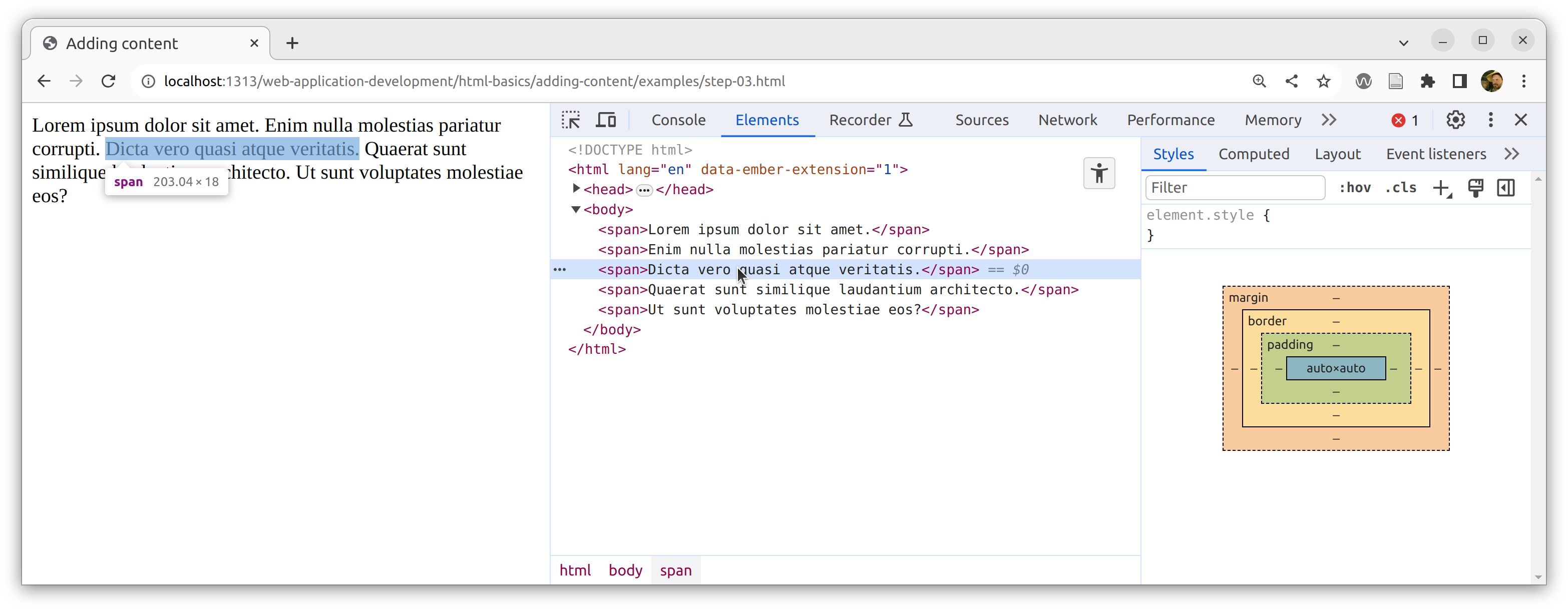
Elements where the display property is left as the default inline will flow like text.
A basic example of an inline element is a <span>.
Just like <div> elements, <span> elements don’t have any semantic meaning and they are often used to control specific pieces of text, as we shall see in later exercises.
What happens if we wrap each chunk of text in a <span> element?
Let’s try it.
 1
 2
 3
 4
 5
 6
 7
 8
 9
10
11
12
13
14
15
<!DOCTYPE html><htmllang="en"><head><metacharset="UTF-8"><metaname="viewport"content="width=device-width, initial-scale=1.0"><title>Adding content</title></head><body><span>Lorem ipsum dolor sit amet.</span><span>Enim nulla molestias pariatur corrupti.</span><span>Dicta vero quasi atque veritatis.</span><span>Quaerat sunt similique laudantium architecto.</span><span>Ut sunt voluptates molestiae eos?</span></body></html>
Our <span> elements allow the text to flow just like in the original example.
So the span effectively does nothing by default.
We can see that no styles are applied to our <span> elements.
Notice that the display property is not explicitly defined.
In the HTML specification the initial value for the display property is defined as inline.
<span> elements
However, the <span> does allow us to apply styles to specific bits of text.
Try changing one span to an <a> element (an anchor or hyperlink).
You will need to link to somewhere with an href attribute.
 1
 2
 3
 4
 5
 6
 7
 8
 9
10
11
12
13
14
15
<!DOCTYPE html><htmllang="en"><head><metacharset="UTF-8"><metaname="viewport"content="width=device-width, initial-scale=1.0"><title>Adding content</title></head><body><span>Lorem ipsum dolor sit amet.</span><span>Enim nulla molestias pariatur corrupti.</span><span>Dicta vero quasi atque veritatis.</span><ahref="#">Quaerat sunt similique laudantium architecto.</a><span>Ut sunt voluptates molestiae eos?</span></body></html>
Notice that hyperlinks are inline elements, so they flow with text.
Anchor tags also have a few other styles which change their color, cursor and text-decoration properties.
Images
The web isn’t only about text, we can also add multi-media images and video.
The above image is served by lorem picsum, a service that can be used like lorem ipsum text to include placeholder images into page designs before the ‘real’ images are available.
There are many similar sites, we will use placecats.com for the remainder of this exercise,
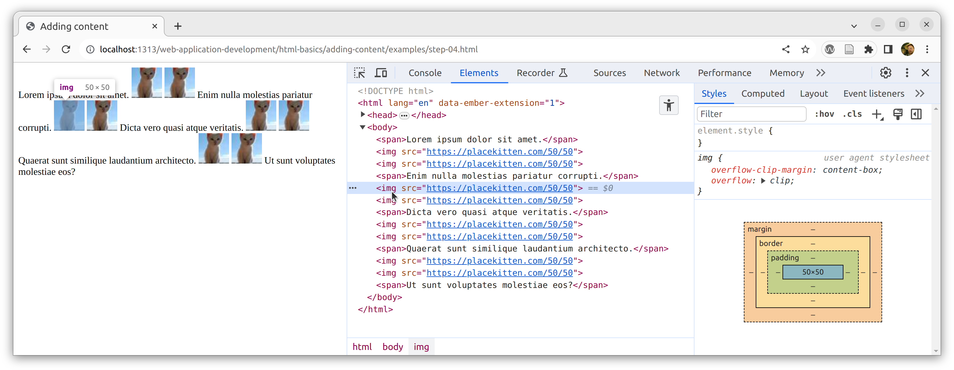
Images are inline elements but they don’t behave quite the same as other inline elements.
This is because images are so-called replaced elements and somewhat special rules apply.
Images have very similar behaviour to an inline-block element, a kind of mixture between inline and block elements.
They will stack horizontally, a bit like inline elements, however, unlike inline elements, they do conform to the box model and can be given margins and padding etc.
We will cover images in more detail later.
For now, just note that images behave in a slightly different way to most elements.
What happens if we add multiple <img> elements between our <span> elements?
<!DOCTYPE html><htmllang="en"><head><metacharset="UTF-8"><metaname="viewport"content="width=device-width, initial-scale=1.0"><title>Adding content</title></head><body><span>Lorem ipsum dolor sit amet.</span><imgsrc="https://placecats.com/50/50"alt="A placeholder cat"><imgsrc="https://placecats.com/50/50"alt="A placeholder cat"><span>Enim nulla molestias pariatur corrupti.</span><imgsrc="https://placecats.com/50/50"alt="A placeholder cat"><imgsrc="https://placecats.com/50/50"alt="A placeholder cat"><span>Dicta vero quasi atque veritatis.</span><imgsrc="https://placecats.com/50/50"alt="A placeholder cat"><imgsrc="https://placecats.com/50/50"alt="A placeholder cat"><ahref="#">Quaerat sunt similique laudantium architecto.</a><imgsrc="https://placecats.com/50/50"alt="A placeholder cat"><imgsrc="https://placecats.com/50/50"alt="A placeholder cat"><span>Ut sunt voluptates molestiae eos?</span></body></html>
In a real situation, the alt attributes would briefly describe the image.
The result is that the images are placed in the flow of the text but since they are much taller than the text, they are creating extra space between the lines.
The text continues to respond to changes to the viewport size.
Inline images
Notice that there is a gap between the images.
This is standard inline behaviour, just like the first example.
Any spaces (or newline characters) between the <img> elements are reduced to a single space.
Try removing the spaces between the elements like this.
We have seen the basic default behaviour of the main kinds of elements.
We can use these rules to compose a site which has a sensible basic layout without any custom CSS rules.
By knowing which elements are inline and which are block we can get something working reasonably well and make the job of styling much simpler.
<!DOCTYPE html><htmllang="en"><head><metacharset="UTF-8"><metaname="viewport"content="width=device-width, initial-scale=1.0"><title>Adding content</title></head><body><h1>Lorem ipsum dolor sit</h1><p>Lorem ipsum dolor sit amet <strong>consectetur adipisicing elit</strong>. Fugit eveniet, cum omnis illum enim, fuga magnam explicabo sunt voluptates harum, atque aliquid ad tempora sed? Quod blanditiis delectus quam eligendi quo pariatur reiciendis nesciunt, hic reprehenderit, aperiam sequi cum praesentium.</p><p>Cumque molestias nemo dolor recusandae quos excepturi voluptas alias modi, consequatur atque, dignissimos error reiciendis ullam magni neque enim omnis possimus ea quas. Iure quod iste adipisci nobis odit dolore quae dolorem nisi doloribus, vitae molestiae, sequi illo, vel unde?</p><figure><imgsrc="https://placecats.com/200/150"alt="A placeholder cat"><imgsrc="https://placecats.com/200/150"alt="A placeholder cat"><figcaption>Two cat images</figcaption></figure><p>Lorem, ipsum dolor sit amet consectetur adipisicing elit. Necessitatibus animi esse odit harum enim perspiciatis. Aliquam corrupti architecto consectetur, neque saepe nulla cumque perspiciatis eaque? Quisquam architecto ab rem, suscipit explicabo voluptas animi, in corrupti ipsa temporibus consectetur doloremque deserunt?</p><h2>Lorem ipsum dolor sit amet</h2><p>Lorem, ipsum dolor sit amet consectetur adipisicing elit. Iste distinctio saepe illum ad, veniam officia quis excepturi architecto earum? Reprehenderit harum ut cupiditate, debitis recusandae praesentium alias! Debitis earum exercitationem veritatis alias, nostrum, quaerat tempora rem nihil, assumenda adipisci minima.</p><ul><li>Lorem ipsum dolor sit amet consectetur, adipisicing elit. Ad, rerum.</li><li>Nisi similique <em>cupiditate</em> officia odit! Aliquid culpa nostrum dolor non.</li><li>Asperiores <ahref="https://www.dmu.ac.uk">nesciunt libero</a> optio maiores enim quo, voluptatem quos tempora.</li><li>Ratione commodi provident omnis fugit dicta recusandae accusantium earum facere?</li><li>Labore eius quas perspiciatis ipsa distinctio, illo cum eum ut!</li><li>Beatae unde sed, assumenda earum incidunt quisquam quos ipsa. Deleniti!</li></ul><p>Dolores nesciunt quisquam quis eaque at <em>aliquid inventore corporis debitis sunt</em>, iure doloribus ullam minus in voluptatem odit dolorem eligendi mollitia quaerat ea. Asperiores nostrum laborum, assumenda perferendis, odio similique totam perspiciatis, fuga vero saepe explicabo et! Illum, magni ut?</p><form><labelfor="input">Lorem</label><inputid="input"type="text"name="lorem"><button>ipsum</button></form></body></html>
Notice we used block elements to create the main structure and inline elements are always inside block elements.
The <h1> and <h2> elements provided headings with larger default font-size and font-weight.
The <p> elements are used to break the text into distinct chunks.
If you study the paragraphs you will notice that the margins overlap.
We will talk about margins in more detail when we introduce the CSS box model.
We used a <figure> element to contain the images along with a <figcaption>.
Finally, we used a <ul> element containing <li> elements to create a list of bullet points and a <form> element to collect user input.
We also included inline elements, primarily the <img> elements but also a few <strong> and <em> elements to format the text differently, an <a> element providing a hyperlink and at the end we included a <label>, an <input> and a <button> within the form.
It looks OK.
Notice that the height of each block element is determined by it’s contents.
When we make the viewport narrower, the text and the images wrap automatically.
So the site is perfectly usable on mobile devices.
There are problems on wider devices because the paragraphs become very wide and difficult to read.
Adding semantic structure
Having <h1> and <h2> elements is good.
It adds semantic structure to the document.
Every page should have an <h1> element (preferably only one per page) as a visual equivalent to the <title> element.
The <h1> to <h6> elements provide an ARIA heading role which helps define a navigable structure for assistive technologies.
Sites should always use headings to assist navigation.
It’s rare that you would use anything beyond <h3>.
Also, never use headings simply because you want bolder or larger text, headings are meaningful and can create confusion if they are used for anything other than to provide document structure.
But we can do a lot better than this.
A typical HTML document should also provide a set of basic ARIA landmarks to help assistive technologies understand where stuff is and to support navigation.
We can do this by using sectioning elements such as <section>, <nav>, or <main>.
In the developer tools, inside the elements panel you should see the toggle accessibility tree button:
The accessibility tree is a view of the site structure as seen by assistive technologies such as screen readers (which will announce the site verbally).
Notice that the tree is fairly chaotic.
All the content is there, but its basically just a great long list of content.
Remember you can toggle this view on and off with the button.
Let’s upgrade the site with some semantic structure.
<!DOCTYPE html><htmllang="en"><head><metacharset="UTF-8"><metaname="viewport"content="width=device-width, initial-scale=1.0"><title>Adding content</title></head><body><header><h1>Lorem ipsum dolor sit</h1><p>Lorem ipsum dolor sit amet <strong>consectetur adipisicing elit</strong>. Fugit eveniet, cum omnis illum enim, fuga magnam explicabo sunt voluptates harum, atque aliquid ad tempora sed? Quod blanditiis delectus quam eligendi quo pariatur reiciendis nesciunt, hic reprehenderit, aperiam sequi cum praesentium.</p></header><main><p>Cumque molestias nemo dolor recusandae quos excepturi voluptas alias modi, consequatur atque, dignissimos error reiciendis ullam magni neque enim omnis possimus ea quas. Iure quod iste adipisci nobis odit dolore quae dolorem nisi doloribus, vitae molestiae, sequi illo, vel unde?</p><figure><imgsrc="https://placecats.com/200/150"alt="A placeholder cat"><imgsrc="https://placecats.com/200/150"alt="A placeholder cat"><figcaption>Two cat images</figcaption></figure><p>Lorem, ipsum dolor sit amet consectetur adipisicing elit. Necessitatibus animi esse odit harum enim perspiciatis. Aliquam corrupti architecto consectetur, neque saepe nulla cumque perspiciatis eaque? Quisquam architecto ab rem, suscipit explicabo voluptas animi, in corrupti ipsa temporibus consectetur doloremque deserunt?</p><h2>Lorem ipsum dolor sit amet</h2><p>Lorem, ipsum dolor sit amet consectetur adipisicing elit. Iste distinctio saepe illum ad, veniam officia quis excepturi architecto earum? Reprehenderit harum ut cupiditate, debitis recusandae praesentium alias! Debitis earum exercitationem veritatis alias, nostrum, quaerat tempora rem nihil, assumenda adipisci minima.</p><ul><li>Lorem ipsum dolor sit amet consectetur, adipisicing elit. Ad, rerum.</li><li>Nisi similique <em>cupiditate</em> officia odit! Aliquid culpa nostrum dolor non.</li><li>Asperiores <ahref="https://www.dmu.ac.uk">nesciunt libero</a> optio maiores enim quo, voluptatem quos tempora.</li><li>Ratione commodi provident omnis fugit dicta recusandae accusantium earum facere?</li><li>Labore eius quas perspiciatis ipsa distinctio, illo cum eum ut!</li><li>Beatae unde sed, assumenda earum incidunt quisquam quos ipsa. Deleniti!</li></ul></main><footer><p>Dolores nesciunt quisquam quis eaque at <em>aliquid inventore corporis debitis sunt</em>, iure doloribus ullam minus in voluptatem odit dolorem eligendi mollitia quaerat ea. Asperiores nostrum laborum, assumenda perferendis, odio similique totam perspiciatis, fuga vero saepe explicabo et! Illum, magni ut?</p><form><labelfor="input">Lorem</label><inputid="input"type="text"name="lorem"><button>ipsum</button></form></footer></body></html>
This kind of structure is very helpful for users of screen readers as it allows major structural parts of the site to be listed and skipped etc.
We have isolated some content in a <header> and a <footer> and placed everything else in a <main> element.
The new page looks identical to the previous version.
However, you should see that the accessibility tree now has some extra top-level structure which can be used by assistive technologies to make navigating the site easier.
Exercise
Hopefully you have been experimenting as you worked through the exercises.
Take 30 minutes to make the nicest, most attractive and interesting page you can, taking images and text from the web or using lorem ipsum text but without adding any style information.
If you are struggling, then work together with a class-mate.