The box model
Lab exercises are designed to help you gain practical experience with web technologies. You should elaborate on these exercises to confirm you understand and deploy the learning you find here in your own code.
In this exercise we will introduce the CSS box model in detail.
The box model relates to five main CSS properties.
- width
- height
- margin
- padding
- border
These properties (and many other derived and related properties) control how much space an element takes on the page.
Highlighting our elements
We will begin by looking at the example from the previous lab exercise.
Adding the following <style> element into the head, with a single rule.
| |
We don’t usually like to embed
<style>elements into our HTML, but this is just for a quick demonstration before we use the recomended<link>element and create a separate stylesheet.
What this has done is added a black outline to every element in the page.
Notice that every element is a rectangle.
The outline property is not part of the box-model. It is drawn on top of the element, it doesn’t add pixels to the element. So, unlike the border property, it doesn’t impact how much space an element takes up.
Default margin and padding
There is blank space around some elements caused by margin and in one case, padding. Have a look using the developer tools.
For example the headings and paragraphs have space above and below caused by margin.
Whilst the <figure> element has space all the way around, also caused by a margin.
One element, the <ul> which creates our bulleted list also has blank space to its left.
It’s not obvious until we look at it with the developer tools that this is caused by padding.
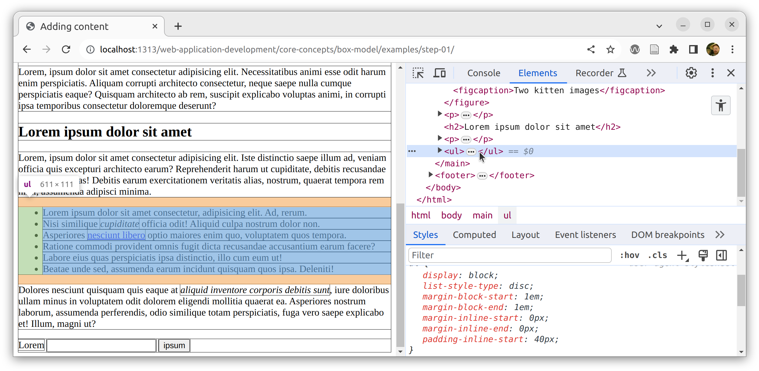
padding on the <ul>
Look through all the elements and make sure you are confortable with what the default values do.
Now, before we continue, we should replace the <style> element with a <link> to a separate stylesheet file.
| |
Our HTML file doesn’t need to change from now on. We can focus on the CSS code.
Create the file styles.css with the following content.
| |
We have reduced the thickness of the outline and added a transparent background color to all the elements.
There are loads of ways to specify colours in CSS.
Commonly you might see named colours such as
redor hex colours such as#f00.Specifying colours using hsl or rgb gives a bit more control.
You should see something like this.
It should be clear that due to the transparent colour, the more deeply nested elements are darker than the top-level elements.
For example, the <figure> is darker than the <main> and the <figcaption> is darker than the <figure>.
Notice the inline elements such as <strong>, <em>, <a>, <label>, <input> and <button> are all deeply nested and darker.
Removing the margin and padding
We can remove all the default margin and padding like this.
| |
The result is that all the space between (and within) the elements is reduced to nothing.
Though, there are still empty spaces in our page because our block elements (such as the <h1>, <h2>, <p>, <figure> and <li> elements) still take up the full width of their containers and in many cases, the inline or text content within these elements doesn’t take up the full width.
Notice also that the
<ul>element is completely covered by its child<li>elements because they are block elements.Also, if the viewport is tall enough to contain all the content, we can see the background of the
<html>element revealed at the bottom of the page. If the viewport is too short to fit the content then a scroll bar is added and the body becomes hidden because the last element determines the height of the<body>.
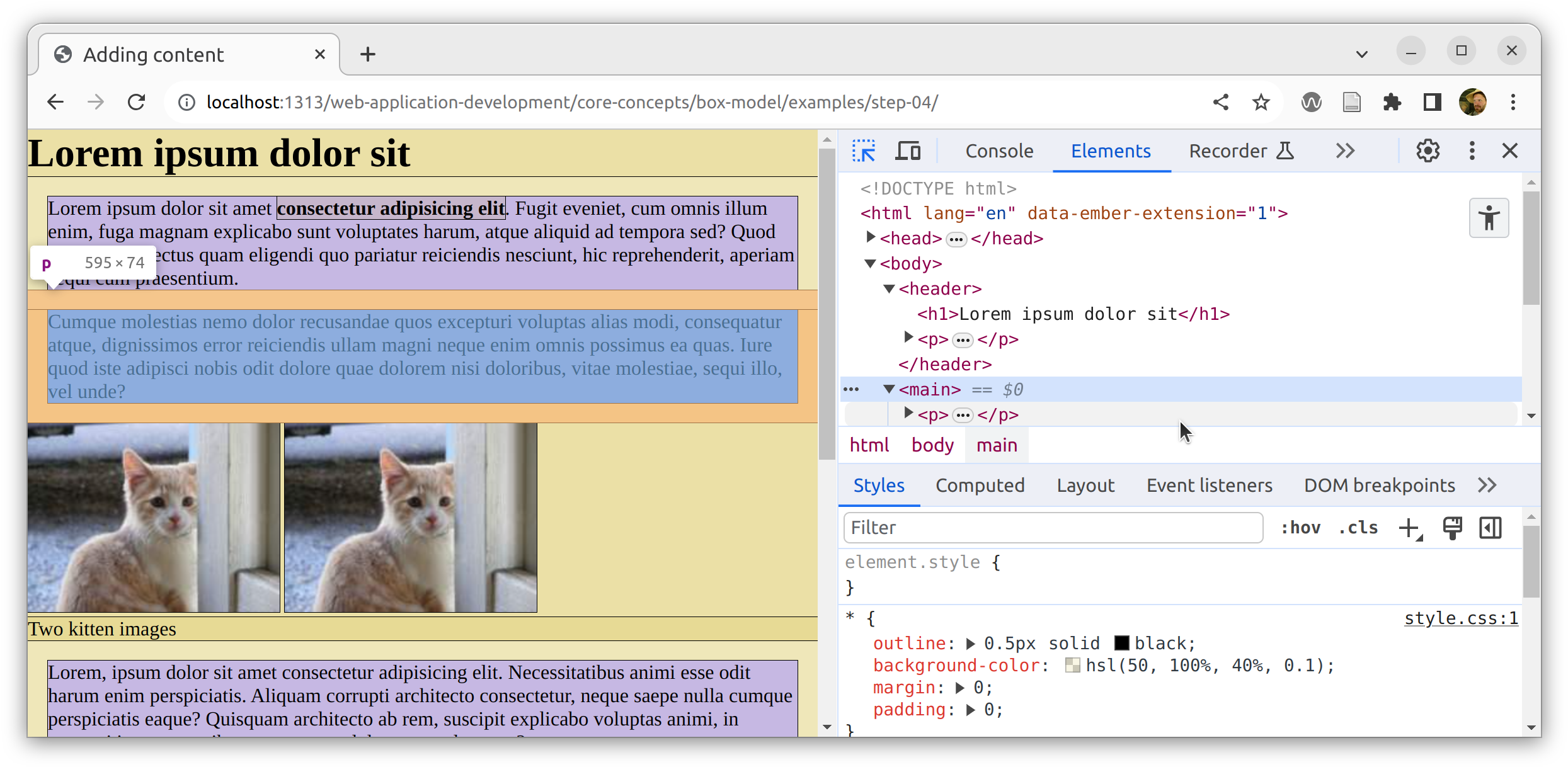
Margins
Now let’s explore what impact adding margins to paragraph elements has.
We’ve added a 1rem margin, all the way round all the <p> elements.
We’ve also highlighted them in a different colour for clarity.
Before looking further, try to predict what you expect the impact of this change to be.
| |
The rem unit is the root font size, effectively the same size as one line of text (at the root of the page). There are many other units we could have used but rem is often a good one to choose for box model properties because it will be relative to the font-size.
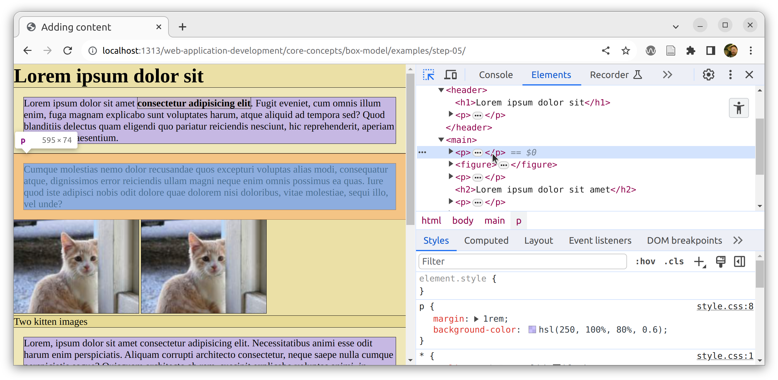
Look carefully at the result. This may not be quite what you predicted and it is a common source of confusion when starting out with CSS.
We can see that there is now a space around all the paragraphs into which no other elements are allowed to be placed. However, some of the paragraphs have clear space around them within their containing element whilst others are placed right up to the edge of their containing element.
Notice how the first paragraph has three margins (top, left and right) inside the <header> and one (the bottom margin) sits outside the <header>?
Similarly, the second paragraph has three margins (left, right and bottom) inside the <main> and one (the top margin) sits outside the <header>.
Not only that, but these margins are overlapping.
The distance between the <h1> and the first paragraph is the same as the distance between the first two paragraphs.
overflowing margins
This is expected behaviour for block elements. The left/right margins will always sit within the parent element. However, the top/bottom margins can overflow (i.e. escape) the edge of the parent element by default.
This actually produces a nice result in many scenarios because the spaces are even. However, there are many cases where you might want to prevent this overflow.
Preventing margin overflow
A modern way to prevent this overflow is to set the display property of the parent element to flow-root.
This creates a new formatting context, a top-level container for a new hierarchy. In which case, the parent element will increase in size to contain the top/bottom margins of all its children.
| |
An older way to prevent this was to set the parent overflow property to auto. This is now discouraged as it has other side-effects.
Doing this in our case adds extra space between the top two paragraphs.
Inspecting in the developer tools reveals that both the <header> and the <main> elements now contain the <p> element margins.
preventing overflowing margins
Padding
Whereas margins create space around and between elements, padding creates space within elements. Let’s modify our stylesheet to remove the margins and add padding instead.
| |
The impact is that the <p> elements are now bigger, with space around the content.
The padding is added inside the element.
There is no longer space between or around the paragraph elements.
Border
We mentioned above that the border property adds pixels to the size of an element.
Let’s highlight our <figure> element and add a thick border.
| |
This adds 100px around the edge of the <figure> element.
Notice how the <figure> element size is affected differently in each direction.
The <figure> still takes up the full width of the container and the space available for the images and the <figcaption> has been reduced.
The <figure> height has grown automatically, pushing content down the page and ultimately increasing the total height of the containing <main> and <body> elements.
block elements will automatically stretch to take the height of their contents.
Try adding padding and margin to the <figure>
| |
The addition of margin creates space around the <figure> and the padding takes up space within the <figure>.
Again, the content is being squeezed in the horizontal (inline) direction but the figure is growing in the vertical (block) direction.
Notice that the images and caption are running out of space. Try adding more margin and/or padding and see what happens to them.
| |
Since the images are inline elements, they can wrap onto two lines and further increase the height of the block <figure> element.
The text inside the <figcaption> can do the same.
If we restrict the space even further, the images will overflow the figure because they have intrinsic width.
width and height
Messing with the width and height CSS properties should be done with care. Especially the height property, because the automatic default behaviour is usually exactly what we want.
Before we begin, let’s return to sensible settings for the <figure> and highlight the <li> elements in red.
| |
This produces a reasonable starting point.
Avoid fixed heights
Say we think our list items are too short. So we naively hard-code an increase to the height property.
| |
The result seems to have achieved what we wanted, the list items now have some additional space.
However, there is a problem lurking.
The default value of the height property is auto.
For block element, this enables the default behaviour of stretching to the size of the content.
Our change has overwritten this value and forced the height of our <li> elements to always be 30px, even if the content requires more space.
So, if the site is viewed on a narrower, mobile device causing the text to wrap, the content will overflow the <li> elements causing a major readability issue.
Notice that all the other elements gracefully respond to the narrow viewport by increasing their height accordingly.
Only the <li> elements are failing to respond.
Clearly, a simple solution is not to mess with the height property at all, but to add some top/bottom padding.
Notice below we give two values to the padding property. padding is a shorthand property. When two values are provided, the first is applied to the padding-top and padding-bottom properties and the second value is applied to the padding-left and padding-right properties.
| |
Alternatively, if the height is really what you want to affect, then you could set the min-height property.
18
19
20
21
li { background-color: hsl(0, 100%, 80%); min-height: 30px; }This would behave just as normal but would prevent the elements height from falling below the specified value.
Be careful with absolute widths
Setting the width property of elements carries the same warning as the height property. It should be done carefully, considering the impact on users with narrow viewports.
However, there are some common patterns which prevent elements from getting too wide. In particular, setting a max-width on an element will prevent it from growing beyond the specified size.
Here we apply a max-width to the <body> element.
| |
We used a value of 75ch, which means (roughly) that the page content should be a maximum of 75 characters wide. This is a good maximum for paragraph readability.
The result is not quite what we wanted. The width has been restricted, and it works fine in narrow viewports, but we want the content to be placed in the middle of the viewport with gaps on either side.
The reason for this is that the deafult value for margin is zero. So there is zero margin on the left and the element doesn’t reach the right side of the viewport.
We can place the <body> element centrally by setting the left and right margin properties to auto.
| |
For all the box properties, margin, padding and border there are variations which apply to the top, right, bottom or left only (e.g. margin-top, margin-right, margin-bottom, margin-left). There are also variants which apply to the top and bottom sides only (e.g. margin-block) and the left and right sides only (e.g. margin-inline).
This divides the available space between the margin-left and margin-right properties and the <body> element is placed in the middle.
Hey, the bullet points are back!
They were hidden because they behave in a strange way by default.
We can bring them back inside the <ul> by adding a small margin-left to the <li> elements.
| |
Now we can see a sliver of the <ul> element which contains the <li> elements.
Handling larger content
The example images are small, only 200 x 150px. Let’s increase the image size to 600 x 300px in our index.html file.
| |
This produces a serious problem.
The images have an intrinsic size which is wider than the containing <figure> element because the <figure> is restricted to the max-width of the <body> element.
So we are working within a limited space and the images overflow the <body>.
Notice that with a smaller viewport they also overflow the entire viewport causing a horizontal scrollbar.
A common and very simple solution to this problem is to set the max-width property of the images to 100%.
| |
This will ensure that the images always stay within their parent element and will be scaled down as necessary.
No overflow. The scrollbar has gone.
Challenges
Make sure you complete these challenges.
Alignment
Look at the content inside our headings, paragraphs, figure and list items. Notice they are not all lining up on the left side of the page. It’s generally good practice to ensure everything lines up.
Remove as many styles as possible and try to create something like this:
The default values are often good enough. This one uses 21 lines of CSS to override just seven of the default values.
Inline elements
Try modifying the box-model properties of inline elements such as <strong> and <em> elements.
What do you notice?
Experimentation
Now create a new HTML document that clearly explains all the things you have learned. Include CSS code to demonstrate with examples.
Maybe something like this?
Look up the class selector and the decendant combinator. Think about how the example above used these to target images within the different figures.